Saturday 1 June 2013

Truth coffee We Roast Coffee Properly - ain't that the truth. the best coffee locally by far even better than 'that other' international brand not taking away from them though. This hang-out is in Buitenkant Street and it's attention to detail and the love of making a great place to be that makes this place really amazing.

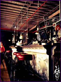
It is a Steam Punk themed coffee shop so the only place for it to be is in an old industrial Victorian building. Owing to the fact that this is an old building that had a new fit-out the atmosphere is real and you sense it as you walk past without even entering. The Espresso Bar (bottom right) is prefect for buying coffee and a snack on the fun and the lettering along with various entrances and buzzing vibe ads to the industrial presence.

The bar is a pressed metal and is a great counter part to the machinery of the coffee roaster in the back.

Some of the old structure is left behind and the concrete casing has been removed to expose the beautiful cast-iron structure. The floor is supported by timber beams and all the additional furniture and structural pieces have a raw industrial feel all themed with the steam punk aesthetic.


The brilliantly crafted machinery is the main draw card of the coffee shop well that and the truly fantastic coffee. 

A back of store shot showing how the attention to detail is carried right through. So much love has been put into the  store with a small bits of machinery that highlight this point.

A very happy skilled art piece as a character adder to the room.

Finally the wood chairs that you sit on. made very simply but innovatively with plumbing  pipes and joints. The chairs can swing in and out in typical Steam Punk over machined fashion.

All in all this is s a brilliant coffee shop with as much love that goes into the actual shop as into the coffee. And yes I am  a very big fan of Truth Coffee.

Wednesday 13 March 2013

Hugo Lambrechts Music School

Alright be offline for a while good to be back the next to posts have a music theme. Enjoy.

Attending a music event in support of  a friend is an assured great evening. Especially if he is the very talented violinist and producer, Ruan Liebenberg. The journey to the Auditorium is like an adventure to something great. You venture through a slightly deteriorated CBD to a building that turns it's back on the road. Then you step into the entrance path.

The building slowly invites you inside with the inside/ outside space relationship blurred thanks to the curved sweeping lines, stepping segments cutting into each other and frameless curtain walls.

In the reception area the spaces flow past each other with mezzanine floors creating differentiation and procession in the bottom space, while offering a smaller more intimate space above.

Then you step into the auditorium. It has a warm atmosphere owing to the wood cladding and bright lights. The curved form makes for a very inviting happy space. The seating is arranged for each person's enjoyment. The pockets of seating makes for more personal mini audiences, while giving height and a sense of formalness to the space. The evening was very enjoyable with young artists opening. Then leading on to the main event at the end where the most experienced artists as well as the principle taking part in a show. The favourites of the evening were the more dramatic movie music pieces such as various pieces from the Pirates of the Caribbean movies.
Looking from the mezzanine level one is still in contact with the goings-on below but has a spatial separation which creates a calmer space for those who want to relax or focus.


The gentle curves of the building make the whole event feel special. The space below the mezzanine is where tickets are purchased as well as various refreshments. Thus the procession would be a smaller space denoting entrance, into a large space for many people to stand together and meet up without feeling claustrophobic to a more intimate space for softer interaction for purchasing various items to a large, warm soft space for a grand main event.

The quiet.

This building sings architecturally like the music that issues from the finely crafted and practiced instruments in the auditorium.

Skrillex

Skrillex at the Ostrich Ranch. What an experience!
The great thing about an event like this is the way everyone shouts all kinds of nonsense. we were cheering for Skrillex in Alvin Risk's set and shouting "YEAH BOY!" The DJ's were PHENOMINAL we got there for Niskerone's set, the local big name in drum and bass. After him was Haezer another HUGE local DJ. Then was Alvin Risk who displayed a wonderful balance in his set between skull crushing madness and light floating tunes. What made him great? He did his own vocals! Next up 12th PLANET! He was crazy when he did the stage dive after dancing around the stage it was the pinnacle of his set. It was then followed by a 30 minute countdown. 

The countdown featured scenes in Cape Town, what an AMAZING city. Then out came the man himself SKRILLEX. Go to the link to see a short clip of what made his performance so good. https://www.youtube.com/watch?v=oPvbp3-j610

The whole evening was filled with lights, strobes, pirotechnics, lasers, smoke and RED FLAMES that blasted sky high  when he dropped the beat. The graphics were very well concieved with bright colours, big movement and fantastic designs.

This man is such an entertainer. He was jumping from one side of the booth to the other like a  10-year-old with ADHD who just got a new Wii. It was great to see such passion. Then when he played cinema he said, "This one goes out to all the ladies. Guys turn to the closest lady and ask her respectfully if you can put her on your shoulders." Then all that was seen was a crowd of ladies above the audience enjoying his masterpiece. 

Another time he got up on his booth, while the song was building, hyped up the crowd, jumped down and then DROPPED the climax as if the world was going to end. At one stage he removed his glasses and headphones so that he could head-bang... That's how crazy it was.

Another moment that was breath-taking was when he slowed down the tempo and played Summit. The lasers moved gently through the smoke and it formed a canopy like in a forest. It was serene and beautiful. It was the way that Sonny Moore combined brilliant music, balance between high point and slow down, graphics, flashing lights and audience engagement that made this so special, truly a night I will never forget.

Monday 8 October 2012

Muizenberg Whale

http://www.zigzag.co.za/multimedia/exclusive-pics-whale-carcass-washes-up-in-false-bay/

So there was a Southern Right Whale that died on the shore of Muizenberg Beach I couldn't be there but thankfully Zigzag was there it's a shame to see.

Charly's Bakery


Named after the boss's husband this is the front facade of the most romantic building in Cape Town. Reason being it is the number 1 place to buy wedding cakes run by women and it even had it's own show on TV usually you can eat here today it was a bit windy but I'll update another time with all the people.
And if you look closely you'll see wedding inspired cupcake motif on the walls.
A beautiful building in it's own right with wonderful rhythms in the various elements on the facade.
It's easy to see why there is so much love for this building...
Some greenery gives a friendly feel to this building on the fringe of the city a piece that is seeing more and more interesting installation such as the Truth steam-punk coffee shop that I'll feature soon.
Do not be fooled though there are some hardcore users of the shop look at this beast that was parked outside.
A paint technique called 'true fire' it is one of the most desired paint effects in the modified car world .
Yes is has a bit of a spitfire theme with the star graphic, bullet holes, flames and Mrs Dina Mite on the side seen in the next picture.
very sporty stance that tells tales of eating up cars and long stretches of road alike.

Old Mutual Building exterior


So this is the exterior of the Old Mutual Building. Note some interesting details. There are animal heads on the corners of the building appearing as if carved in. Also something that probably wasn't meant to be is the steel handrails that have left their rust stain to the front of the building. Adding a touch that actually adds to the feel of the building making it seem old in a sort of phenomenological manner.
Here is the entrance with the sun gleaming of the Granite clad Entrance way.
There are various stories illustrated on this frieze that goes all along the building. It features colonizers and tribesmen alike.
Here are large warriors on the side facade. This adds to the Egyptian theme of the building. There are Art Deco influences in this building as seen on the previous post's entrance. The frieze , shiny stone clad facade, large statues, grandiose bulking and verticality and triangular windows speak to an Egyptian theme that features largely in the Art Deco era's architecture. The old appearance mentioned earlier inadvertently helps in this theme.
The proportion of the space between the buildings is very comfortable and I often find myself plotting my daily routes so as too pass through this space.
Top right is the Old Mutual Building.

And that is why I was so pleasantly surprised with the interior of the building- totally unexpected. 


Wednesday 22 August 2012

Old Mutual Building

All right it's about time that I'm back! So the bridge that was posted last led to this building look at the simplified facade and interesting windows beautiful! And wait for the surprise.
THIS IS THE ATRIUM! I was walking around like the man who discovered the Cullinan Diamond! A rare and brilliant find I had to run back to work after this exploration not to be late. 

Suspended lightweight steel walkways with maritime themed ties.

These glowing stars add a fastacy-like atmosphere. What I like about this building is it opened my eyes to how impressive well thought out emotive space can be.

A close up of the ties.
In architecture techtonics or how things join is CRUCIAL and here is how they joined pipes with rods nicely done and not exceedingly costly.

And this is the entrance that I left through. Marble clad walls with Art Deco style finishes. All in all well well worth the exploration a truly impressive building. Next, an exploration of the Facade.